Skip to content

Conversation

@hosy
Copy link
Collaborator

@hosy hosy commented Jan 12, 2021

Description

This PR improves the UI-Design for Right-to-Left languages.
The most views were already prepared for RTL support, but we had some missing UI elements, which were not ready for RTL.

Related Issue

#861

Motivation and Context

Give users which are on a Right-to-Left language a perfect UI experience.

How Has This Been Tested?

Change language to Arabic and check if view design is mirrored compared to the Left-to-Right UI design.
Please have a look at the Screenshots section, which elements were changed:

  • Account list
  • Settings (Mostly rows on the bottom)
  • File list
  • File list sort bar
  • Sort popover
  • More menu
  • Account to file list animation direction

Screenshots:

English Left-to-Right Arabic Fixed Right-to-Left Arabic Outdated Right-to-Left
en_accountlist new_accountlist old_accountlist
en_filelist new_filelist old_filelist
en_more_menu new_more_menu old_more_menu
en_settings new_settings old_settings
en_sortbar new_sortbar old_sortbar

Push Animation

Wrong Push Animation Direction Fixed Push Animation Direction
ezgif-7-ab3d5008f72d ezgif-7-9352b3fde683

Types of changes

  • Bug fix (non-breaking change which fixes an issue)
  • New feature (non-breaking change which adds functionality)
  • Breaking change (fix or feature that would cause existing functionality to change)

Checklist:

  • My code follows the code style of this project.
  • My change requires a change to the documentation.
  • I have updated the documentation accordingly.
  • I have read the CONTRIBUTING document.
  • I have added tests to cover my changes.
  • All new and existing tests passed.

hosy added 2 commits January 8, 2021 16:09
…hich were not designed for right to left text support.
…-to-Left UI support

- changed some missing views to support RTL support
- moved icons in the 'More Action View' from the left to the right side, which is equal to the UIMenu UI element
- adapted push transition animation for RTL
@hosy hosy requested review from felix-schwarz and jesmrec January 12, 2021 13:18
# Please enter a commit message to explain why this merge is necessary,
# especially if it merges an updated upstream into a topic branch.
#
# Lines starting with '#' will be ignored, and an empty message aborts
# the commit.
@hosy hosy added this to the 11.5.0-Current milestone Jan 12, 2021
@hosy hosy linked an issue Jan 12, 2021 that may be closed by this pull request
@hosy hosy self-assigned this Jan 12, 2021
Copy link
Contributor

@felix-schwarz felix-schwarz left a comment

Choose a reason for hiding this comment

The reason will be displayed to describe this comment to others. Learn more.

Looks fine, except the position of the icons in the action card in both LTR and RTL should be the other way round than this:

English Left-to-Right Arabic Fixed Right-to-Left Arabic Outdated Right-to-Left
en_more_menu new_more_menu old_more_menu

If there is no other way, we may need to take care of the view layout for these StaticTableViewRow type(s). Don't hesitate to let me know if I can help.

@hosy
Copy link
Collaborator Author

hosy commented Jan 14, 2021

Looks fine, except the position of the icons in the action card in both LTR and RTL should be the other way round than this:

If there is no other way, we may need to take care of the view layout for these StaticTableViewRow type(s). Don't hesitate to let me know if I can help.

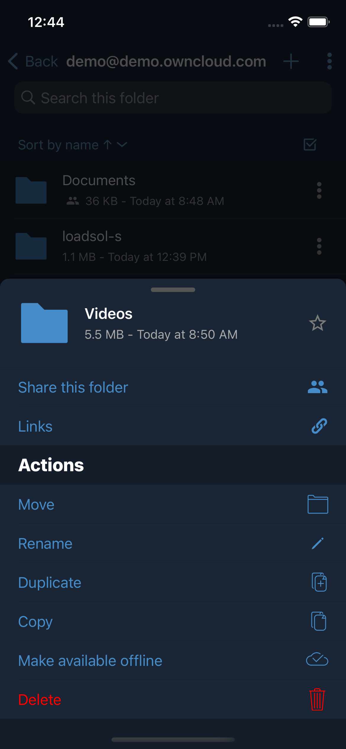
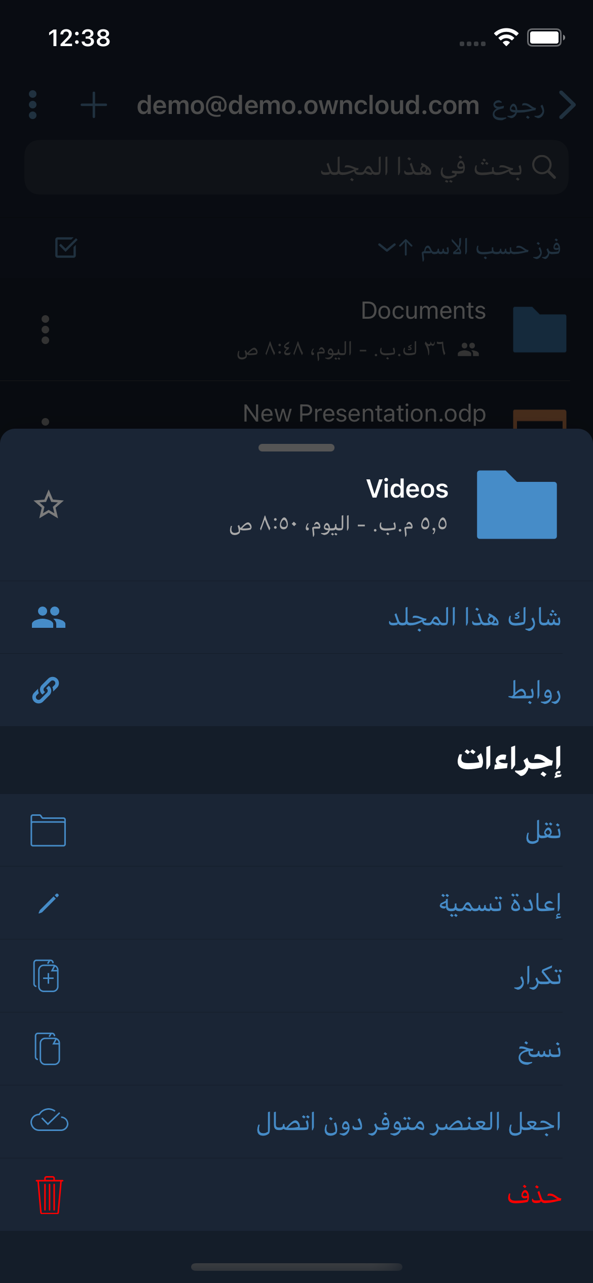
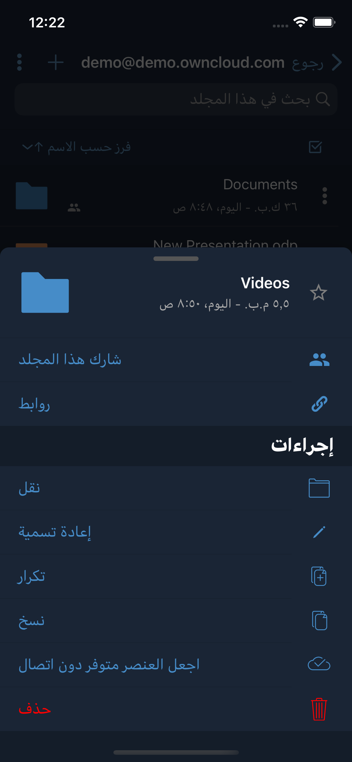
I changed the icon position from the left side to the right side (LTR), to adopt this to the UIMenu. So in RTL the icon position on the left side is correct. You can see, it is mirrored to the LTR design.

Simulator Screen Shot - iPhone 12 - 2021-01-14 at 13 59 56

@felix-schwarz
Copy link
Contributor

felix-schwarz commented Jan 14, 2021

I wish iOS itself was more consistent there:

  • for alerts (like we use when hitting the "+" button for a folder), it presents the icons on the left
  • for context menus, it presents them on the right
  • for the share sheet, it shows them on the right

Alerts are the oldest of these three design patterns, and the other two are both much newer and much closer to our "card" view. So yeah, you're absolutely right and the change of position for the icons is actually more in line with recent iOS design. Maybe I've gotten used to the icons being in the left spot for too long now 😀

Approved!

@hosy
Copy link
Collaborator Author

hosy commented Jan 14, 2021

@felix-schwarz you are right! With iOS 14 we should remove this view with the UIMenu implementation.

@jesmrec
Copy link
Contributor

jesmrec commented Jan 18, 2021

I performed some exploratory testing through the app to check if views' layout is RTL. I put only focus in the view, no features were tested/checked.

From my side this is approved.

@jesmrec jesmrec self-assigned this Jan 18, 2021
@jesmrec jesmrec added the Approved by QA Approved by QA label Jan 18, 2021
@jesmrec jesmrec merged commit ce9ca7c into milestone/11.5 Jan 21, 2021
@delete-merged-branch delete-merged-branch bot deleted the fix/rtl-ui-adaptions branch January 21, 2021 08:46
Sign up for free to join this conversation on GitHub. Already have an account? Sign in to comment

Labels

Approved by QA Approved by QA

Projects

None yet

Development

Successfully merging this pull request may close these issues.

Three dots should be to the left side (when using Arabic language)

4 participants